When creating Google Ads search campaigns targeting keywords that are competing brands, the majority of advertisers typically direct users to their homepage or the product page without providing a clear comparison.
Competitor search campaigns can be costly because we end up paying a higher price for clicks on our competitors’ keywords. This is mainly because our Quality Score and Ad Rank will be low, as our ad and landing page content has no direct relevance to the keyword we are bidding on.
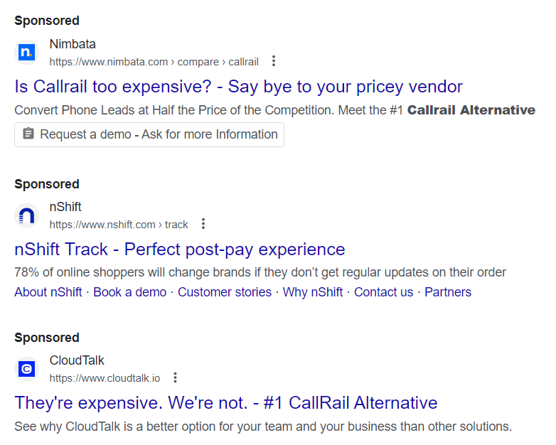
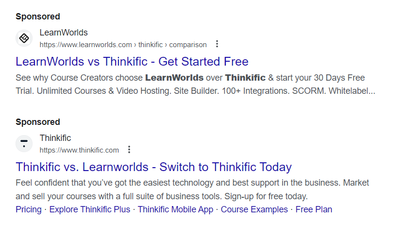
One way to make our competitor ads more relevant, at least from the user’s perspective, is to include our competitors’ brand names in the titles of our search ads and always provide a comparison. For example, “TireChain vs. TireChainRus,” or stating that we are the alternative, or even attacking a weakness of our competition, such as claiming they are too expensive with something like “Is CallRail too expensive?”
Even though the price may not be the most convincing comparative factor, this more direct ad copy to defend against the competition is likely to increase the click-through rate and thus improve the ad’s relevance.
However, the most important aspect is the content or webpage where the user lands. This is where we need to employ our unique selling points to convince the undecided user, who is considering us and our competitors, that we are the better company due to certain advantages we have over other brands.
To make our competitor campaign more effective, we will create a landing page where we compare our service or product directly or indirectly with the competition. We will provide a list of the aspects that our audience values the most when making a purchasing decision and directly compare our offering with others.

For example, in terms of shipping, our product might have the option of delivery within 3 days, while the competition takes a week. Perhaps our product has better finishes, or maybe it is not only more affordable but also offers additional benefits. Maybe our product is more expensive, but it’s worth it because our software’s user experience is more intuitive and easy to use. The point is that we present the user with a visual comparison between our competition and us, clearly tilting the scale in our favor —clearly, but without completely disregarding what the other brand does because users are smart and naturally know that we have created this content—.

Landing page where our brand is directly compared with the competition.
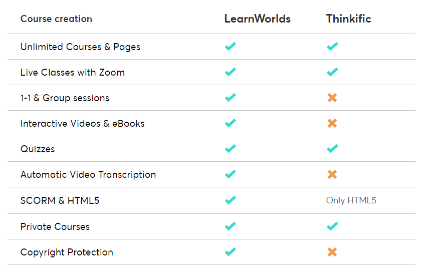
Visually comparing our value proposition with the competition and tipping the scale in our favor.
This way, we provide the user with an invitation to choose us over the competition. In the worst-case scenario, we create doubt in the user’s mind, as most users want to make a confident and quick decision. The good thing is that we are facilitating that decision by having an advantage.
Lastly, we conclude the landing page content with a summary, affirming that our brand is superior after conducting a detailed comparison.
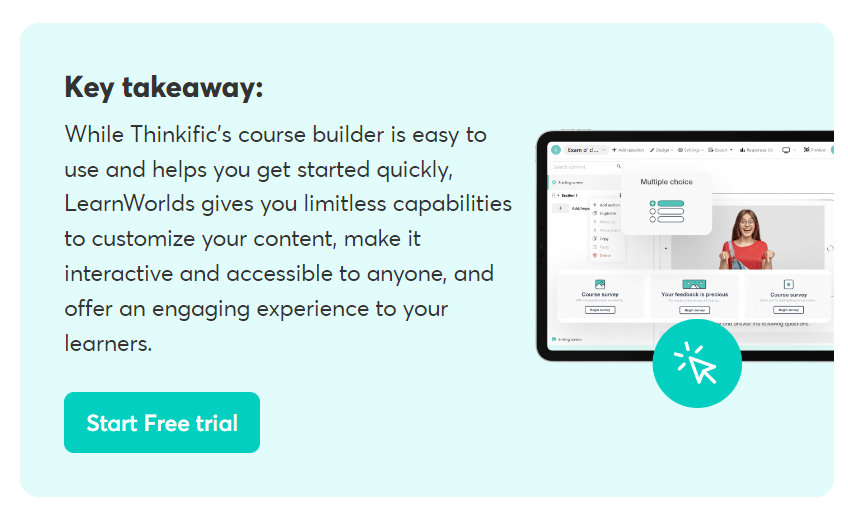
Affirming our superiority and why we are the best choice.
This strategy becomes even more powerful when the competition has no defense, meaning they have no content that compares their product or service with ours.
We can expect the competition to react by comparing their product or service with ours, but by that time, we will have gained an advantage by doing it first. In this case, the user may compare both contents before making a decision; most likely, the brand that is stronger in the aspects that the user values the most will win the purchase from this user.
References:
https://www.learnworlds.com/learnworlds-vs-thinkific-comparison/

